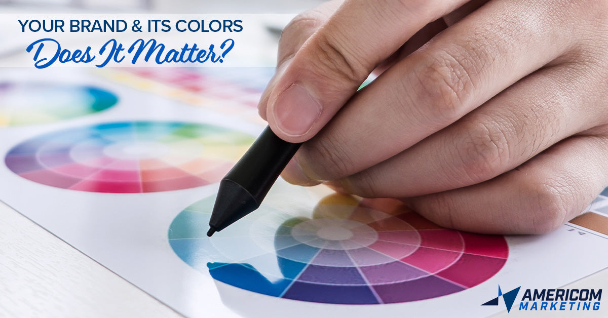
Your Brand and Its Colors
It’s hard to imagine Target without their iconic red bullseye, McDonald’s without their huge golden arches, and Apple without their bright white logo, but those are big, iconic brands. What about a small business, an online store, or a regional product?
When it comes to your brand, is the color all that important?
The short answer is YES. But there’s much more to it than that…
Color Psychology
The psychology of color is used in all forms of advertising and marketing to help evoke emotions and convey a message without the use of words.
“Whether it’s a known brand that is well established or a new, up and coming disruptor trying to break onto the scene, the color alone can help make a great first impression as well as a confirmation in the eye of the beholder,” says Amanda Prince, Social Media & Brand Manager at Americom Marketing. “The color sets the tone and expectation. It says just as much about the audience and their desired experience as it does the brand itself.”
When buying fresh produce, seeing shades of green on labels and company logos suggests the message of natural and healthy foods. Green and earthy tones typically represent organic, eco-friendly products. Companies such as Whole Foods and Tropicana are examples of how brands use color psychology to their advantage.

While green is more prevalent in the produce section, the snack aisle will overwhelm you with bright and vibrant colors. In the highly competitive business of “junk food”, companies are fighting to be the flashiest and most appealing snack to catch your eye. A bag of Lay’s potato chips will surely stand out with its in-your-face yellow packaging. It’s fun, light-hearted, and exciting—just the escape you need for snack time, right?
Color psychology allows customers to feel every emotion that your brand wants to promote as well as combat competitive emotions or overcome the competition. Here’s a quick look at a few colors and how they effect emotion and communication…
GREEN with envy: Green is associated with freshness, nature, health, and even wealth. Green is a color even used to help combat depressive emotions as it symbolizes growthG. Green helps with calm and serenity. Just think of Starbucks, Holiday Inn Express, and any medical spa in the hemisphere; they’re all green for all these reasons.
RED blooded and red-handed: Red is a color of high alert, creating urgency or calling attention. It’s high energy, passionate, and bold. From the red stripes on the American flag to the American Heart Association, red is synonymous with blood and life. It’s often used in food (for balance with effects of green and yellow), sports (intimidation and aggression R), and a highly-effective color for ADVERTISING SALES! Interestingly enough, no one ever wants to be in “in the red” when sales are involved. Red is even known to raise blood pressure and heart rate.
YELLOW and not so mellow: Nothing shows excitement like yellow. For high awareness, positivity, warmth, hope, and energy, nothing captures it all quite like yellow. Yellow is an impulse-shopping color because it provokes cheerfulness, creativity, and joy—even stimulating a logic center in the brain. Yellow notepads, yellow emojis and smiley faces, yellow highlighter, yellow yield signs…it’s no coincidence that Ikea, Subway, and IMDb shine so brightly.B
BLUE in the face: For trust, leadership, responsibility, and peace, you want someone that’s “true blue.” Forget the blues of sadness and sorrow, there’s more to this dominant color. Blue is the color of dependability and logic G as well as calmness and symmetry. Brands like American Express, Navy Federal Credit Union, Capital One, Citibank, and BBVA/Compass bank all use blue as their primary color. Notice anything in common? It’s no wonder that financial brands use blue to communicate all the feels. Blue tends to be a color of reasoning and discipline as well as loyalty and honesty.RBlue has consistently been a statistics favorite for males and art historian, Denis Dutton, claims it as the favorite color in the world perhaps because it conjures landscapes of peace and comfort.T
PURPLE people eaters: Purple has historically been a royal color, associated with wise kings and priests from Leviticus to luxurious Canadian Whisky (Crown Royal). It’s not a “natural” color P so it takes more time and effort to produce the color—fitting for higher positions of nobility or in a hierarchy. Purple marries the action of red and the leadership of blue for an interesting blend that can be taken in a variety of directions, but always communicating Power. This is a color to encourage creative pursuits, inspiration, and philosophical and spiritual enlightenment. S All of these given way to brands in non-profits (Lupus Foundation, Alzheimer Awareness), family-oriented brands (Hallmark, Welch’s), and solutions-oriented brands (Syfy, FedEx, Nexium).
ORANGE you glad?: The fun, friendly color of orange promotes excitement and joy like yellow, but it tends to have a less feminine tone that so many associate with yellow. Orange is an uplifting color that embodies optimism and youthfulness—ideal for a digital brand (Amazon, JBL) or a software brand (HTML 5, blogger) as well as a sunny soda drink (Sunkist, Orange Crush). It serves as a good accent or dynamic punch to help balance out the moody seriousness of blue or green. Though there is warmth and creativity in orange, there’s also some volume with it that can come off as dominating or impatient. V Much like red or yellow, it’s an intense color whereby a little goes a long way.
Ghttps://www.pinterest.com/pin/417075615482259519/?nic_v2=1a5PF9o7o
Rhttps://www.toptal.com/designers/ux/color-psychology
P https://www.scienceofpeople.com/color-psychology/
S https://www.empower-yourself-with-color-psychology.com/color-purple.html
V https://www.pinterest.com/pin/18858892179365055/?nic_v2=1a5PF9o7o
See more colors and meaning here https://www.oberlo.com/blog/color-psychology-color-meanings
Fit the Mold
Depending on the industry, businesses tend to choose colors that fit the personality and image of their brand. When thinking of car brands, a large majority of them are silver, black, and shades of blue. These colors associate a brand with sleek, high-tech, elegant and trustworthy qualities. They back up what the brand represents and stands for; this helps them convey their brand message.
“But it also helps communicate what it says about YOU, the consumer,” says Emily Sumrall, Content Marketing Specialist at Americom Marketing. “A brand color should represent as much as the target audience as it does the brand. This helps in persuasion and brand positioning…”
Stand Up, Stand Out
While on the topic of car brands, a vast majority of them fit in the monochromatic color wheel for the safe, neutral appeal to the masses. On the other hand, there are certain brands that stand out in more ways than one.
For instance, when someone buys a Ferrari, fitting the mold is the last thing they want to do. Ferrari designed their logo just like their cars: bright and out of the box. With every intention to turn heads and raise eyebrows, their logo is bright yellow with accents of red, white and green (the Italian national colors) with a horse in the center. The logo design sets them apart from any generic car brand because they don’t fit into the same category. They wish to showcase the personality.
In taking another look from our beloved bank examples (aforementioned in our BLUE notes) it’s fine for a financial entity to incorporate blue to show trust and loyalty, but it’s also important for a brand to visually stand out from the rest. Take a cue from Wells Fargo: in a sea of blue financial institutions, their bold red and gold marks separate them from the rest. They capitalize on the confidence and volume of red, yet still communicate the same confidence and power that blue holds.
Color can make or break a brand’s identity like these. The more a brand stands out, the easier it is for someone to remember it.
So, Does Color Really Matter for Your Brand?
Understanding the psychology and meaning behind each color is critical in marketing no matter what size or shape of your organization or business.
Creating an identity for your brand should employ color to set the mood, persona, and voice of your brand character. It says who you are and what you stand for. It sets the tone for everything in how you sell and serve. It also sets expectations about you because it positions your audience for how they should receive you.
“Anyone that overlooks the value of color in their brand, in their business or organization, or certainly in their product is just asking for trouble. You have to put brand in position to win and color is an integral part,” says Americom Creative Director, Lance LaRue.
“Imagine a sunny, yellow logo for a funeral home. Or a dark, sleek, elegant and understated logo for a pre-school. It simply doesn’t work,” LaRue continues. “Now imagine a light roast coffee in a dark black back and a dark, navy blue logo. That’s a stark contradiction in sensory reaction for a consumer…it makes it a challenge for them to mentally and emotionally overcome. And that’s a real live case study! That happened with a coffee brand at a competing ad agency years ago. It’s kind of unbelievable that it got that far.”
Show Your True Colors
One color or two? Or seven?
Bold or elegant?
Loud or understated?
Cool and calm or dynamic and high-energy?
Choosing your brand color isn’t always easy. It isn’t so black and white (pardon the pun), but as proven, it can share a large, powerful message to the audience that all the words and imagery in the world simply cannot do.
That’s where we come in!
With 20+ years of experience, Americom Marketing has developed brands in just about every field with just about every budget imaginable. Whether it’s launching a new brand identity or upgrading an established brand mark, our team of award-winning design experts know all the right moves to get the quality attention you deserve and capturing brand values.
Get the right look, the right tone, and the right reaction with your brand identity. Americom’s experience in development and brand management is unmatched as we cover persona, voice, brand messaging, branded visual elements, and yes – brand colors.