Typefaces are critical in design. The type of font, the height, the leading & kerning, and punctuation legibility all work to make a large percentage of the design that most viewers feel, but largely don’t even notice. It often sets the tone, eases or excites the reader, and reveals the personality of the design or brand. Our designers and layout artists know which fonts to stay away from, which ones to cling to, and which ones to use for headlines, which ones to use for body copy, and so forth as any good typesetters or designers do. Comic Sans is often the butt of the joke around our offices as well as the thorn in our side. Our creative director won’t even say Comic Sans out loud without making the sign of the cross & asking for forgiveness. Times New Roman, Courier, Myriad Pro, Calibri, Open Sans, Futura, Playbill, Garamond, Lucida Sans, Impact, Century Gothic, Trajan Pro…the good ones, the bad ones, and the ugly fads in between.
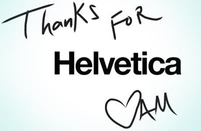
Then there’s Helvetica.
The font was invented in Switzerland at the famous Haas Type Foundry. It’s quiet, loud, strong, bold, soft, firm, and has been described by many as even “perfect.”
Mike Parker passed away this week. He is known as the Godfather of Helvetica (Fast Company). Though he didn’t draw it up, he advanced it. Parker brought it to the world, to pop culture, to life, and from decade to decade. The font is so important there is a documentary film about it. Yes – a documentary about a font. An everyday (as we see it) font. “Helvetica” features the history, uses, implementations of it in logos across the globe and across time, and even debates about it. As an advertising and design firm in Texas – far, far away from the land of Roger Federer & army knives – we found it downright interesting, though about 20 minutes too long if anything. The film also has an interview with Parker, who is fantastically passionate about the font.
Reading about the news on CNN (click here), we felt a bit melancholy. He’s not someone we’ve ever met or know much about, but he is a major part of something we use daily. And it’s simple. And we know that simple doesn’t necessarily mean easy. There will be articles and some good reads about this around the web & trade journals, but we found this article on CNN very interesting. To learn that this man had ideas of being a painter, but he was colorblind; so he thought the next best thing was in black and white – type. Fascinating. Today Helvetica is seen everywhere from the logos of Target, Crate & Barrel, Post-It, & Toyota to the subway directional signs of New York. See here for 40 excellent…
Goodbye, Mr. Parker. We thank you for your contributions to our daily work and for making typeface selections that much easier to make our work look that much better. Long live Helvetica! And may Papyrus, Comic Sans, and Chiller be ever stricken from our machines.


